SPLITWISE
Categorising expenses and tracking payments in Splitwise
Splitwise helps people keep track of their shared expenses and balances with roommates, trips, groups, friends, and family. During Memorisely's UX/UI Bootcamp, I worked to improve the user experience and make this user journey even more enjoyable.
WorkFlow
Qualitative Research Survey
Synthesis in Dovetail
Benchmarking, IA mapping,
Rapid ideation
Wireframing
Tools
Timeline
2023, 10 weeks
Team
Me and Callum
The Problem
Tracking common expenses can be a confusing process that often leads to misunderstandings and wasted time. Our goal is to improve the user experience when categorising expenses and tracking payments in Splitwise to increase adoption of the paid product.
The Solution
By implementing intuitive and transparent features that accurately reflect who paid for what, we aim to build trust and accountability among users, leading to higher conversion rates and sustainable growth for the business. We decided that the best improvement would be to simplify the user journey and make categorisation easier to implement and understand at first glance - making it more intuitive and user-friendly.
The product:
Splitwise is a free tool for friends and roommates to track bills and other shared expenses, so that everyone gets paid back.
The goal:
The goal is to enhance the user experience in categorising expenses and tracking payments in Splitwise to increase adoption of the paid product.
How might we help users to track their payments and categorise their expenses to increase adoption of our paid product?
Qualitative Survey
To gather information and gain insight into the target audience, we conducted a qualitative survey. The survey was created in Google Forms and then made available to the people in the target group. Our goal was to gain insights into user behaviour so that we could incorporate them into the subsequent design process and significantly improve the user experience.
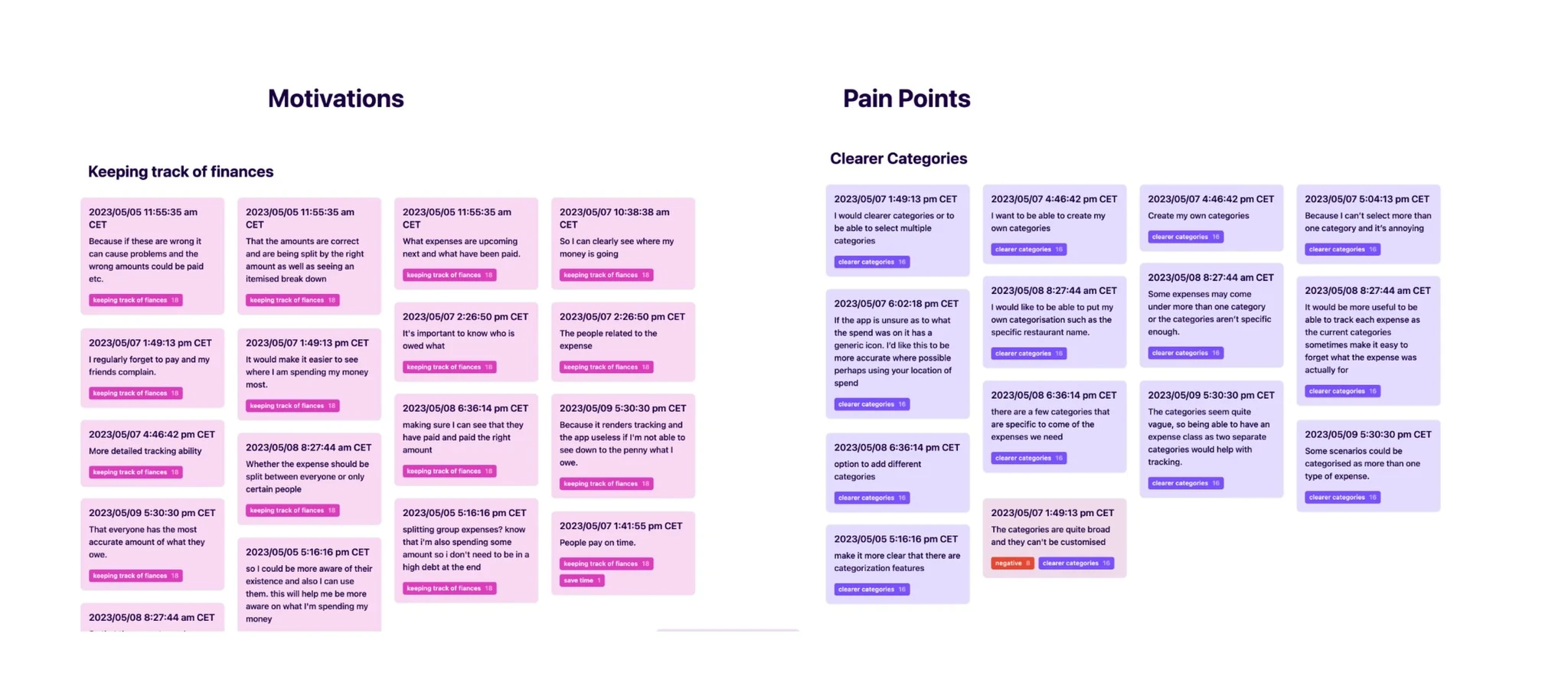
Affinity Map
Using Dovetail, we created our tagging taxonomy and were able to tag survey results. By grouping data points into categories, we were able to identify patterns and trends and visualize them in an affinity map. The goal was to spot trends and identify user experience issues.
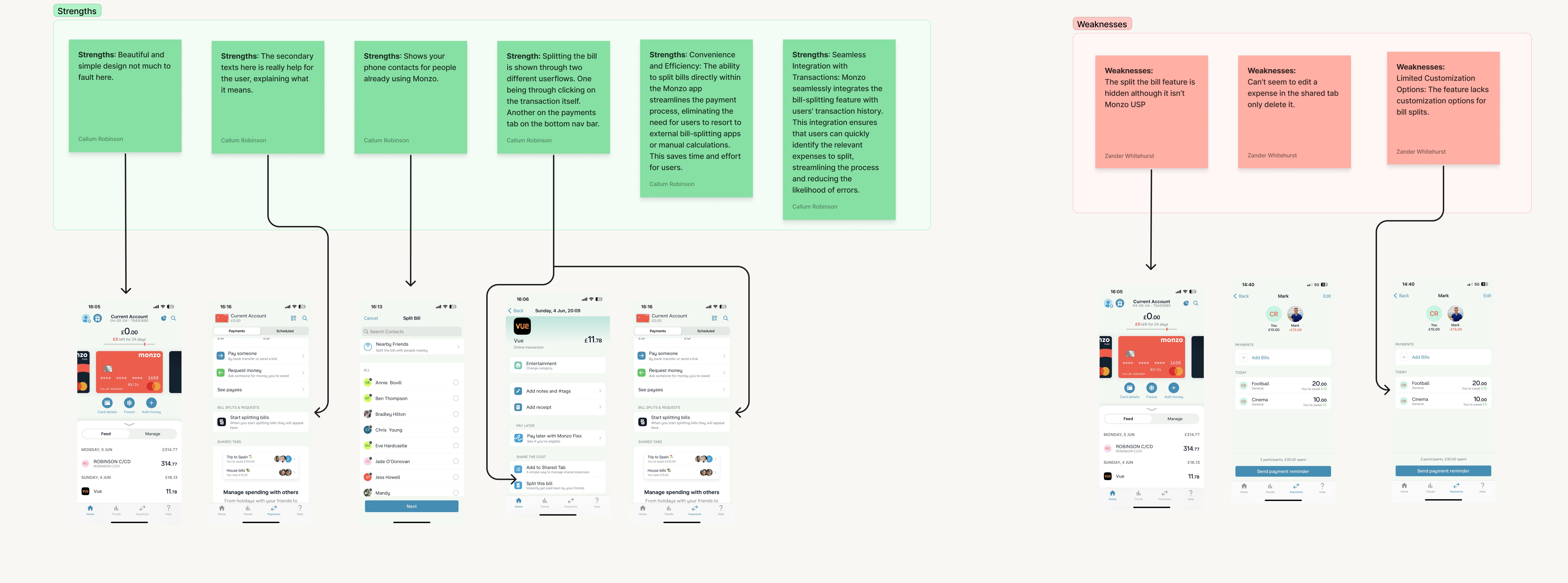
Competitor Benchmarking
By analysing our direct and indirect competitors, we gained insight into the similarities and differences between our products and theirs by better understanding the application market and how users interact with their products. We focused primarily on adding an expense and categorising the expenses. Our goal was to show inspiration for improvements for the problems in the current user flow.
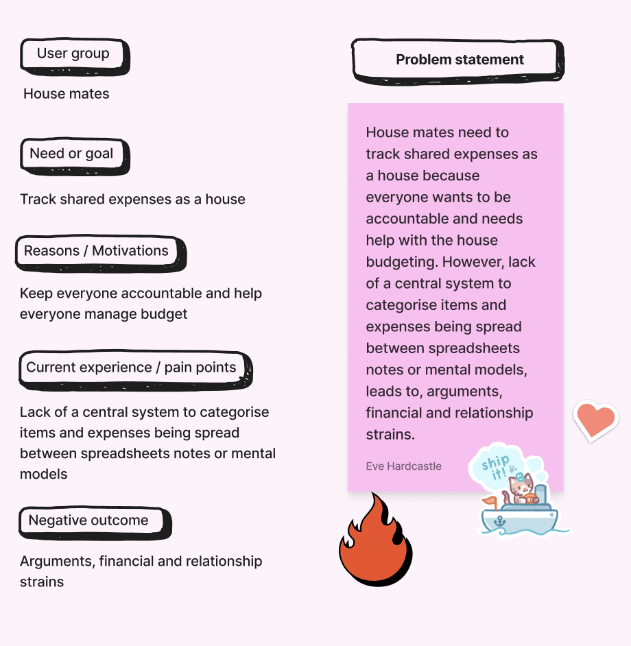
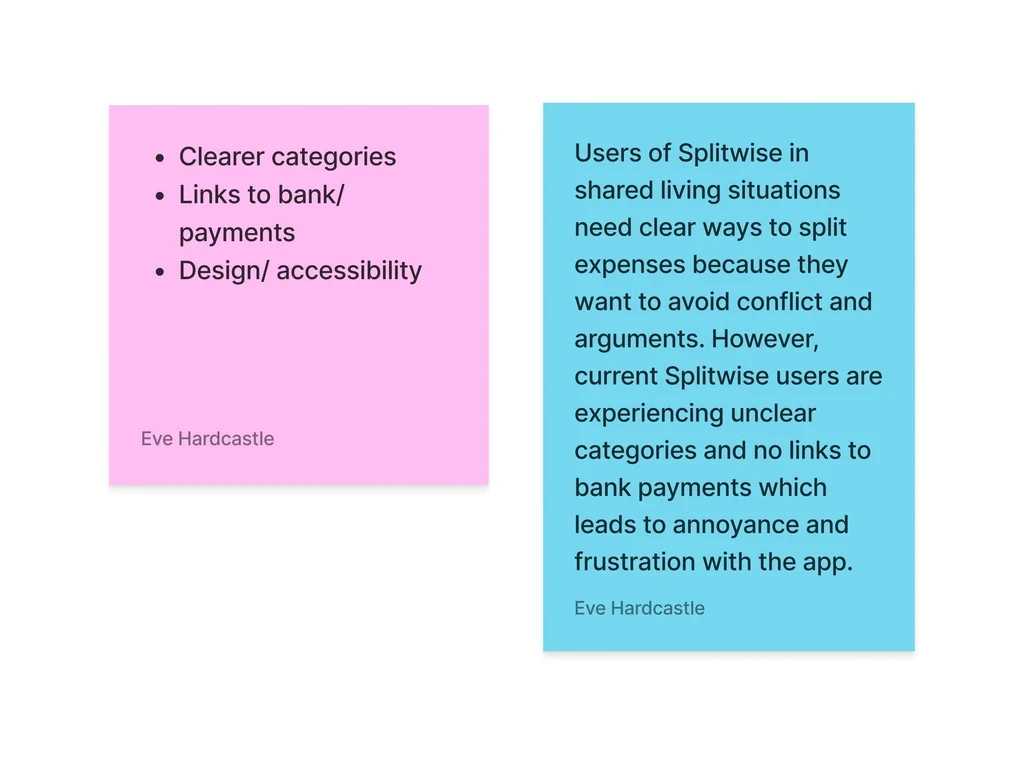
Problem statement
Through our research, using a survey, affinity mapping and information architecture, we were able to discover and gain understanding of what the problems were with the current app. We worked together to write out a problem statement that gave us a clear vision of what we were designing.
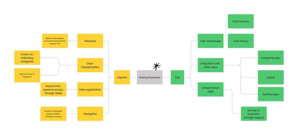
Ideation
In order to generate a broad spectrum of ideas, we created a mind map that focused on possible improvements. Through this we gained an understanding the structure exploration and where to make a start for the improvements.
User Flows
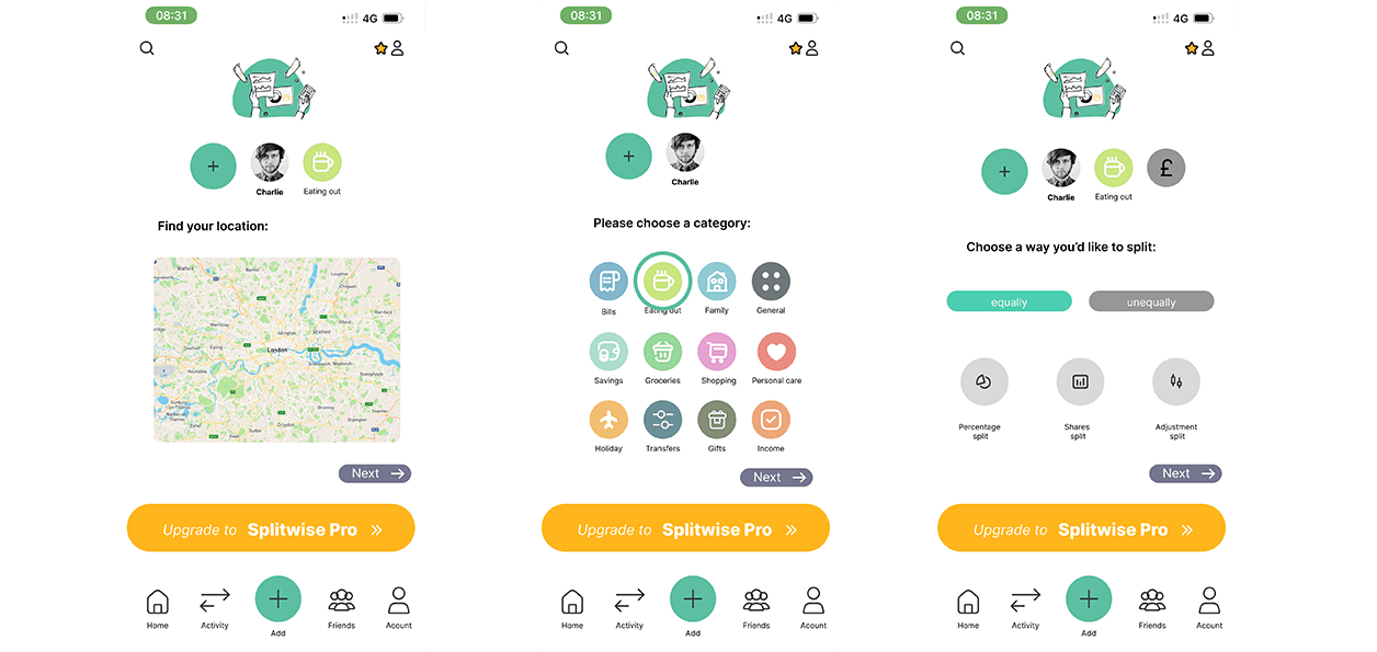
The User Flow Diagram allowed us to visualise the steps the user takes to add and categorise an output. To get an overview of the wireframes needed, we first developed a user flow diagram of the current app and then several versions that incorporated the improvements and ideas we had generated from the ideation phase.
WireFraming
By wireframing the flow, we gained comprehensive insight into each stage of the enhanced user experience, affording us a detailed overview of the necessary screens, elements, and components. We used the rapid wireframing method and created simple low-fidelity sketches, which allowed us to focus on the overall design and functionality.
UI Styles and Components
To define consistent and accessible standards for our component set,we initially specified our grid, colours and text styles. We defined a 4 column grid for our design, which follows the 4 pixel rule. We complemented the primary colour with different shades and added brighter colours for contrast for the pro-version of the app. We defined a neutral colour palette for text and secondary actions. We created standard components such as buttons and cards, and created an icon library that was especially helpful for categorization.