CURRY ZONE
Rebranding and redesign of my local curry house.

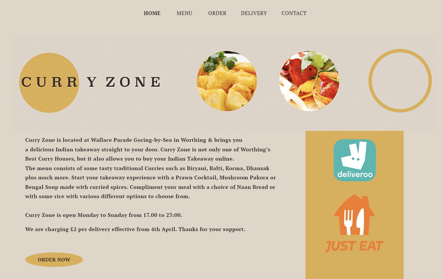
Curry Zone was in desperate need of a redesign of their website and rebranding. I focused on making their menu easier to access, ultimately with the aim of increasing delivery orders. The new logo design was inspired by a plate of curry and using turmeric tones to bring a modern take on my local curry house.
WorkFlow
Client Meeting
Research
Ideation
Designing
Delivering
Tools
Design Process
I undertook a comprehensive redesign and rebranding initiative for Curry Zone, driven by the necessity to enhance their website and overall brand image. My design process began with thorough research, identifying the key areas requiring improvement, particularly the menu accessibility to boost delivery orders.
The central concept of my redesign revolved around the creation of a visually appealing curry plate idea. In this context, I drew inspiration from the vibrant hues of turmeric, incorporating its yellow tones into the design. The utilization of yellow not only serves as a nod to the key ingredient, turmeric, but also infuses a modern and fresh aesthetic into the brand, breathing new life into the local curry house's identity.
The outcome of this design process is reflected in the new logo, which encapsulates the essence of a delectable curry plate while embracing the symbolic significance of the color yellow in representing turmeric. Ultimately, my goal was to provide Curry Zone with a visually captivating and user-friendly brand identity that aligns seamlessly with their objective of increasing delivery orders..